 |
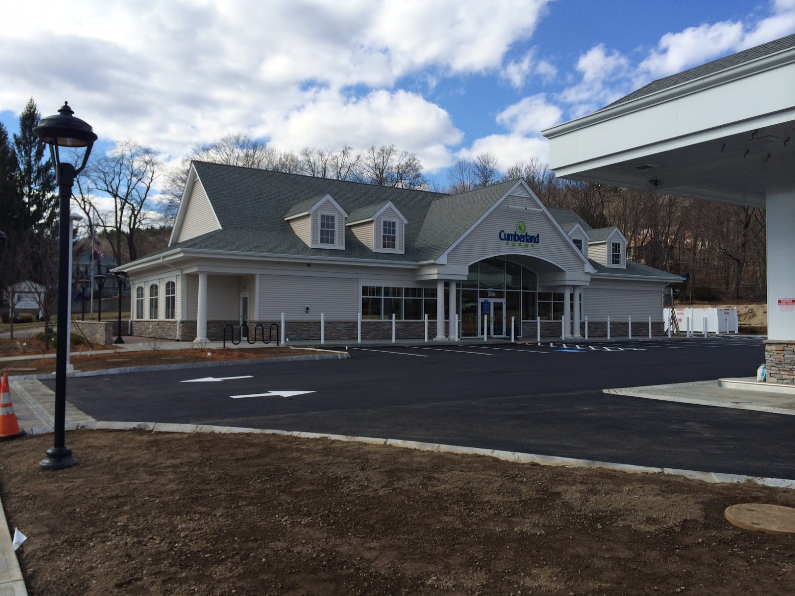
| The light posts along the street, and the dormers on the roof help to soften impact of the building on the neighborhood. |
I believe they have done that.
The design of the building does fit the neighborhood. No longer are we subjected to an industrial looking, flat roofed, brick building from another era. This design, similar to all the other new Cumberland Stores, is not industrial at all. In fact, it is nice, almost charming.
Although it is big, as I noted in the past, what I failed to note was that other areas of design, and building, would be able to offset its appearance, and allow it to be able to blend into the surrounding environment.
It worked.
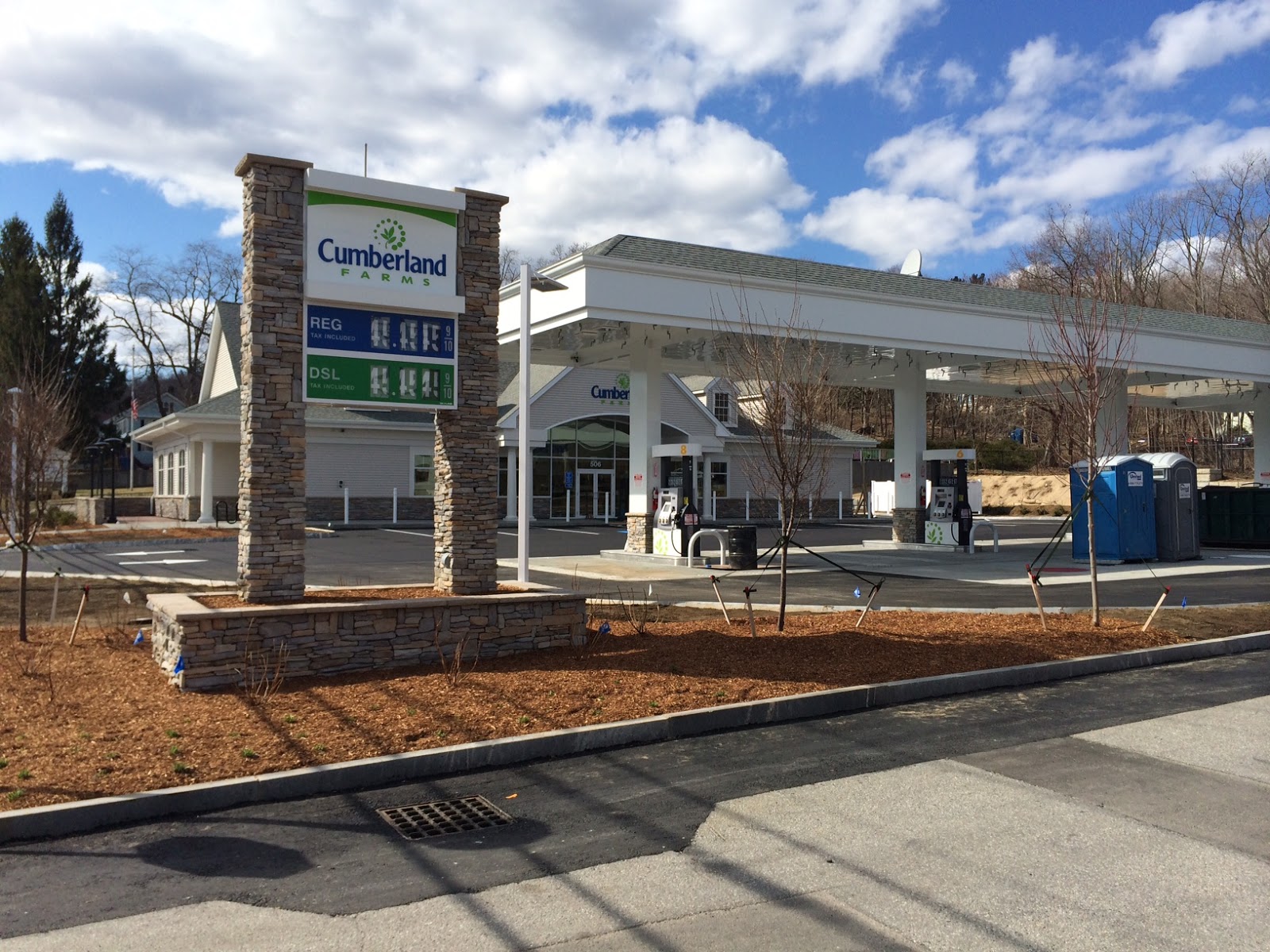
The choice of exterior lighting, the use of stone on the columns of the sign, and along the buildings apron, the landscaping with trees, shrubs, and grasses all have taken a large retail building, and softened it just enough so that it fits very well in the space it already had.
I really messed up on this one.
Not only is the land well landscaped, it is also noticeable that some thought went into everything from the outdoor lighting, to the pump number, and placement.
The traffic pattern is now safer, more efficient, and able to handle more than four cars at a time at the pumps. Now, more cars blocking the road idling perpendicular on Hinman Street while waiting to fill up. That used to frost me, as well as all the folks trying to get in and out of Hinman Street.
When an improvement comes to any neigborhood it shows that others think enough of the area to invest in it. This encourages others to do the same. Who knows what will come to the corner of Holland Road and Route 20 now.
I beleive that the designer, and builder have done a very good job not insulting the neighborhood with some retail monstrosity, and no, I am not on the Cumberland Farms payroll. I just didn't think things all the way through when I wrote last time.
I wish all the other times I was wrong turned out as well as it did this time.
Related Posts:
Thinking Out Loud In Sturbridge: They Went An' Built A Skyscraper
Thinking Out Loud In Sturbridge: Clueless In Fiskdale
Thinking Out Loud In Sturbridge: I Don't Think I Have The Whole ...


I agree with your first assessment. It's big! Not getting down that end of town too much, I only saw two perspectives; a hole and a nearly finished building. The first words to my wife as we drove past the place were, "Holy....! It's a monstrosity! It's out of scale with the rest of the neighborhood! It's like putting an "O Gauge" house on an "HO" railroad platform!" The building dwarfs the Southbridge Credit Union building next door. Don't get me wrong. It's nice, it's a big improvement (wish it were a Wawa). But now the rest of the neighborhood doesn't look right with this comparatively imposing structure plopped sideways on the lot. I'd love to know if the architect considered the surrounding buildings or was this just a cookie cutter design similar to a Cracker Barrel building?
ReplyDeleteWally: be carefull, some might think you are crossing over to the dark side..... :-)
ReplyDeleteHave you noticed that Rovezzi's is also making some improvements? I know more are to come there too.
Tom Chamberland
Haha! Tom, I calls 'em like I's sees 'em! Rovezzi's looks great, too! Can't wait to see what else is on store.
ReplyDeleteIs it the architects job to take into consideration the surrounding buildings? I don't know. It is a bit large i must say, but that its what all the new Cumby's look like. It seems a bit excessive for a convenience store in that location. When is it going to open? A couple days ago it was still being worked on.
ReplyDelete